


In my previous blog, I discussed a numerical library of python called Python NumPy. In this blog, I will be talking about another library, Python Matplotlib.
This tutorial aims to show the whole process of data visualization using Matplotlib. We'll begin with some raw data and end it by saving a figure of a customized visualization.
What Is Matplotlib?
Matplotlib is a multi-platform data visualization library built on NumPy arrays and designed to work with the broader SciPy stack. In simple words, Matplotlib library is a plotting library used for 2D graphics in a python programming language.
One of Matplotlib’s most important features is its ability to play well with many operating systems and graphic backends.
Let's Get Started...
Importing
As usual the first step irrespective of what package you are using is to import it. Start by importing Matplotlib and setting up the %matplotlib inline magic command.
import matplotlib.pyplot as plt
%matplotlib inline
What is %matplotlib inline magic command?
%matplotlib inline turns on “inline plotting”, where plot graphics will appear in your notebook below the code. Here the commands of the cells below the plot will not affect the plot.
However, for other backends, such as qt4, that opens a separate window, cells below those that create the plot will change the plot.
So, back to coding.
After importing. Let's create a simple plot.

To remove information about the plot use semi-colon(;) ie to remove [] use the below code.
plt.plot();
You could use plt.show() to display the plot.
Let's add some data to it.
x=[1,2,3,4,5]
y=[10,20,30,40,50]
A Quick Note - Matplotlib has two interfaces:
- Object-oriented (OO) interface
- Pyplot interface / functional interface
For now, just understand Pyplot is state-based programming whereas the OO interface is object-oriented programming. And OO interface is more customizable and powerful than pyplot.
I know it's a bit confusing concept, I took around a week to figure out but thanks to the vast internet I could finally understand. So I' am planning to write another post about it.
Let's display the data using OO interface.
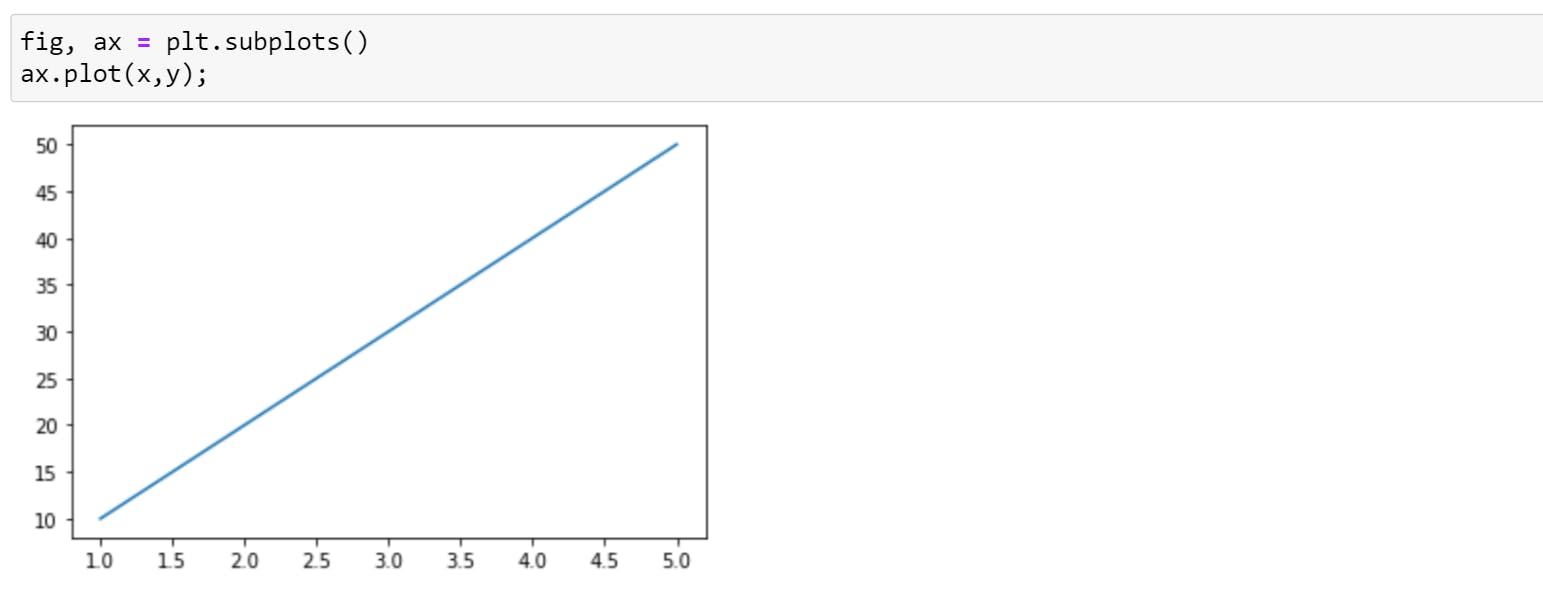
Okay, but what does this code mean?
To understand this, first, we will call .subplots
plt.subplots()
#Output=>(<Figure size 432x288 with 1 Axes>, <AxesSubplot:>)
So, every time we call subplots() function, it will return a tuple with two values. What we did in first-line tuple unpacking.
Note: We created two variables, fig and ax. These are arbitrary names but a standard that everyone follows.
Consider fig as short for figure, you can imagine it as the frame of your plot. You can resize, reshape the frame but you cannot draw on it. On a single notebook, you can have multiple figures.
Each figure can have multiple subplots. Here, the subplot is synonymous with axes(plural of axis). The second object, ax stands for axes, is the canvas you draw on.
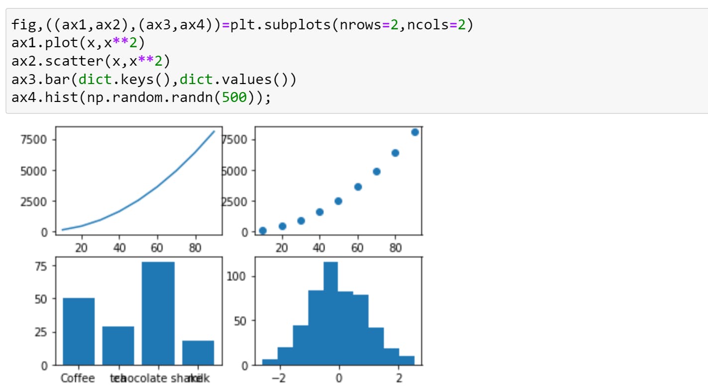
I hope you got some idea about it. To make it more clear we will go through one more example where we will be creating multiple subplots ( plt.subplots() grid system )
fig,ax= plt.subplots(nrows=2, ncols=2)
Output:
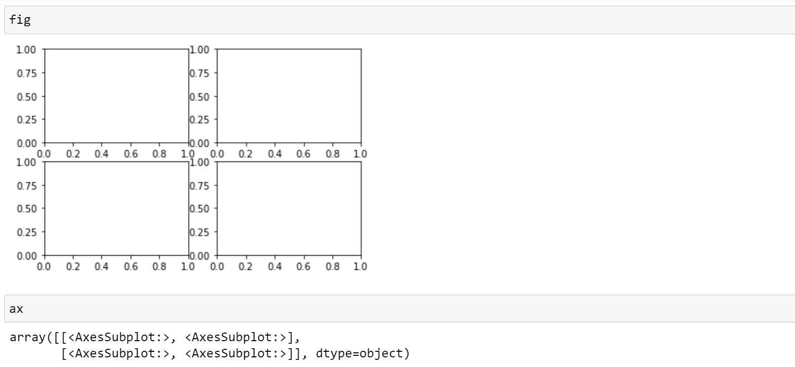
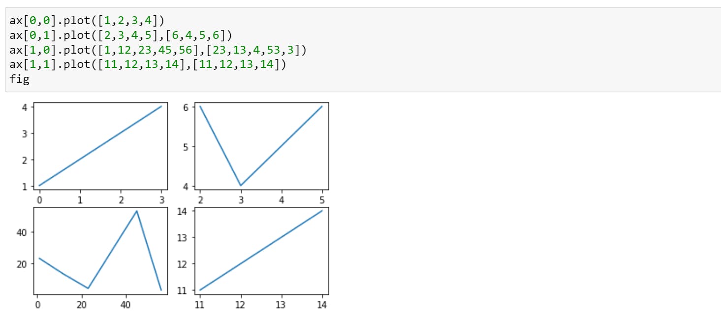
So, here fig is a whole frame that contains 4 subplots and ax is list of individual subplots. You will be using ax with indexes to draw. For example,
You can also customize your plot.
The most common type of plots using NumPy arrays
Matplotlib visualizations are built off NumPy arrays. So in this section, we'll build some of the most common types of plots using NumPy arrays.
- line
- scatter
- bar
- hist
- subplots()
To make sure we have access to NumPy, we'll import it as np.
import numpy as np
Just in case if you don't know what's NumPy. Check out my post about Numpy
Create data:
x=np.arange(10,100,10)
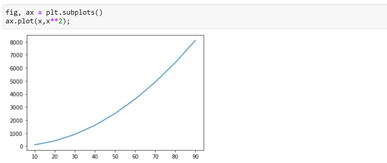
1.Line
As seen from the above examples, the line is the default type of visualization in Matplotlib until and unless you exclusively mention something else.
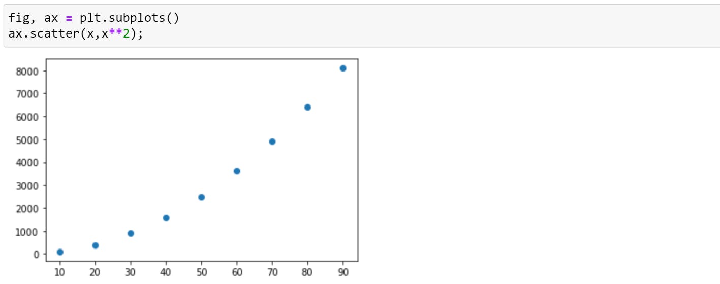
2.Scatter
Scatter plots are similar to line plots. A line graph uses a line on an X-Y axis to plot a continuous function, while a scatter plot uses dots to represent individual pieces of data.
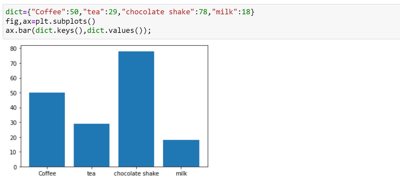
3.Bar
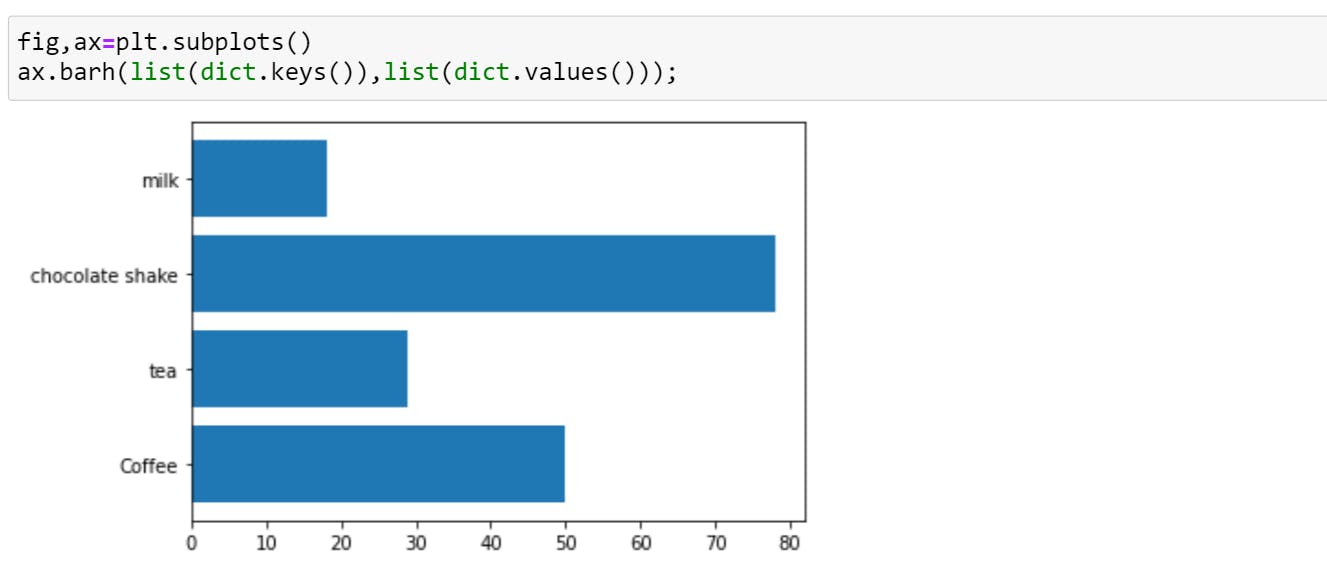
You can produce 2 types of bar graph - Vertical (.bar) & Horizontal (.barh)
A bar plot is a graph that represents the category of data with rectangular bars with lengths and heights that is proportional to the values which they represent. Bar graphs are used to compare things between different groups or to track changes over time. For example,
Vertical Bar .bar
Horizontal Bar .barh
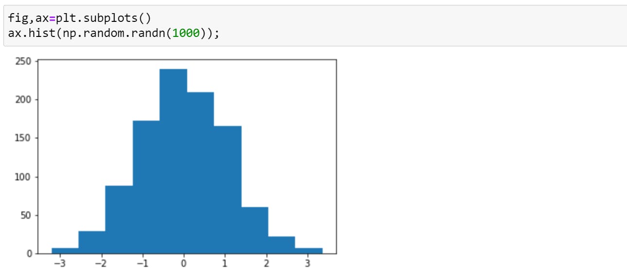
4.Histogram
In a histogram, each bar groups numbers into ranges. Taller bars show that more data falls in that range. A histogram displays the shape and spread of continuous sample data.
5.Subplots
To create subplots, either you can use indexes as shown above or you can allot a new variable to each subplot. For example,
Real-Life Example
Now, that we got some basic understanding of different types of plots, let's create one that you will be using for your projects.
So, what we are going to create here is:
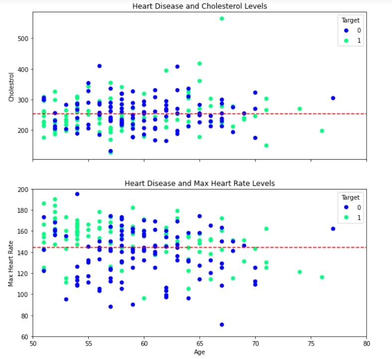
Isn't it beautiful?? Don't worry it's very easy to create one.
So, Step 1 - import panda and matplotlib (with %matplotlib inline)
Step 2, after importing we need data. So here I'm using heart disease data. You can use some other data.
heart_disease=pd.read_csv("../Proj/heart-disease-proj/7.1 heart-disease.csv")
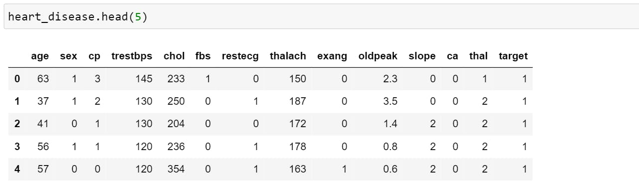
The above image previews only 5 rows. Here target = 0, stands for no heart disease and target = 1 stands for heart disease.
We will be using data of age above 50 for plotting.
over_50 = heart_disease[heart_disease.age>50]
Step 3, To plot a graph, we will be using OO interface.
fig, (ax1, ax2) = plt.subplots(nrows=2, ncols=1, sharex=True, figsize=(10,10))
- nrows & ncols => number of rows and columns
- sharex => Controls sharing of properties among x (sharex) or y (sharey) i.e. if you see in the above plot you can notice that x-axis (age) is shared between both the graphs. By default, the value of sharex and sharey is False.
- figsize => Size of the figure.
Step 4, Mention the data for which data needs to be plotted.
scatter = ax1.scatter(over_50["age"], over_50["chol"], c=over_50["target"], cmap="winter")
- over_50["age"] & over_50["chol"] => It is the data that should be ploted at x-axis and y-axis respectively.
- c => list of colour that plots different data. In our graph, colour depends on "Target" ie when the target is 0, it will show a colour-1 dots and when the target is one, it will show a colour-2 dots.
- cmap =>Matplotlib has a number of built-in colormaps (color combination). So in our graph, "winter" shows a combination of blue and green colour. To know more, check out this documentation
Step 5, Set title & y label for the plot.
ax1.set(title="Heart Disease and Cholesterol Levels", ylabel="Cholestrol")
Step 6, Set x-axis limit. This is an optional step but it makes the graph more beautiful.
ax1.set_xlim([50,80])
Step 7, Create a horizontal line to get a better understanding of the graph.
ax1.axhline(y=over_50["chol"].mean(), color="r", linestyle="--",label="averge")
- .axhline =>Add a horizontal line across the axis.
- y => It denotes the position at which line needs to be drawn. In our example, we took mean level of cholesterol.
- color =>Color of the line
- linestyle => It is the way line should appear. {'-', '--', '-.', ':' etc}
Step 8, Add Legend ( area describing the elements of the graph)
ax1.legend(*scatter.legend_elements(),title="Target")
The elements to be added to the legend are automatically determined when you do not pass in any extra arguments.
Step 9, Repeat the steps for the second plot.
Complete Code
fig, (ax1, ax2) = plt.subplots(nrows=2, ncols=1, sharex=True, figsize=(10,10))

scatter = ax1.scatter(over_50["age"], over_50["chol"], c=over_50["target"], cmap="winter")

ax1.set(title="Heart Disease and Cholesterol Levels", ylabel="Cholestrol")
ax1.set_xlim([50,80])
ax1.axhline(y=over_50["chol"].mean(), color="r", linestyle="--", label="averge")
ax1.legend(*scatter.legend_elements(), title="Target")

scatter=ax2.scatter(over_50["age"], over_50["thalach"], c=over_50["target"], cmap="winter")

ax2.set(title="Heart Disease and Max Heart Rate", xlabel="Age", ylabel="Max Heart Rate")
ax2.set_ylim([60,200])
ax2.axhline(y=over_50["thalach"].mean(), color="r", linestyle="--",label="averge")
ax2.legend(*scatter.legend_elements(), title="Target")

fig.suptitle("Heart Disease Analysis", fontsize=16, fontweight="bold");
But learning matplotlib can be a frustrating process at times...
Why Can Matplotlib Be Confusing?
You may face issues due to the following challenges:
- The library itself is huge, at something like 70,000 total lines of code.
- You will find different ways of constructing a figure with various attributes.
- While it is comprehensive, some of matplotlib’s own public documentation is seriously out-of-date.
So, that's it for today. Please comment down and let me know if I missed something. Thank you reading.